Introduction to ggplot2
ggplot2 \(\in\) tidyverse
- ggplot2 is tidyverse’s data visualization package
- Structure of the code for plots can be summarized as
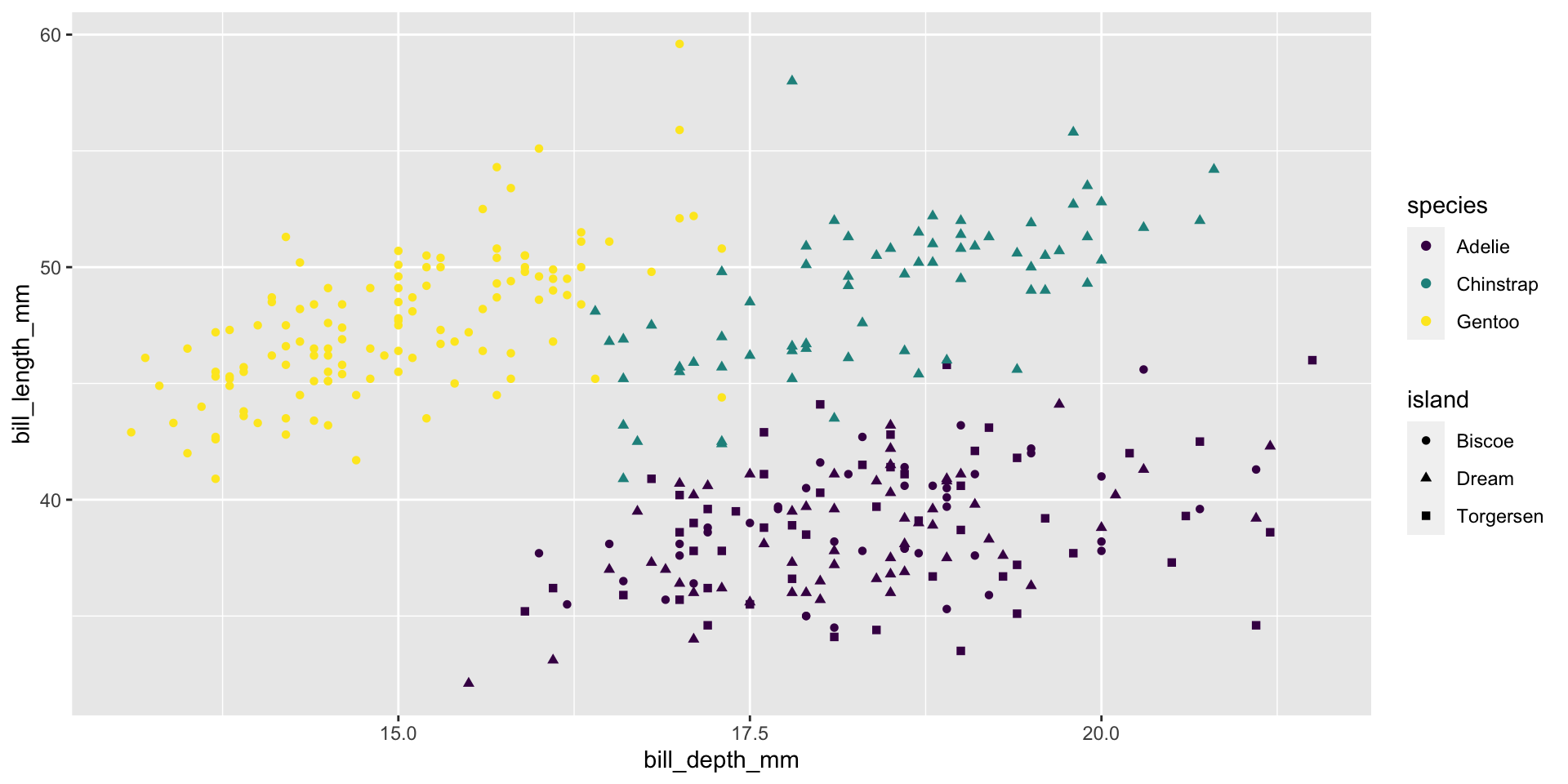
Data: Palmer Penguins
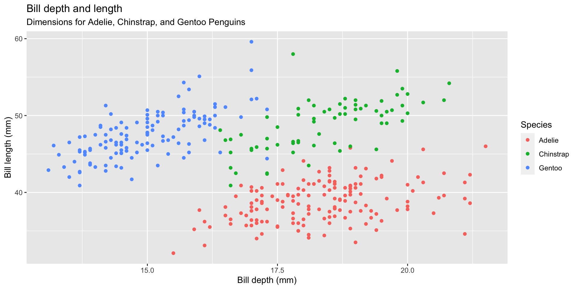
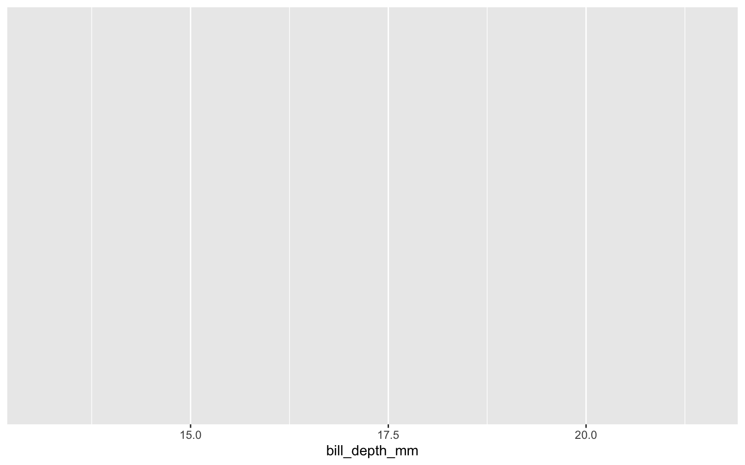
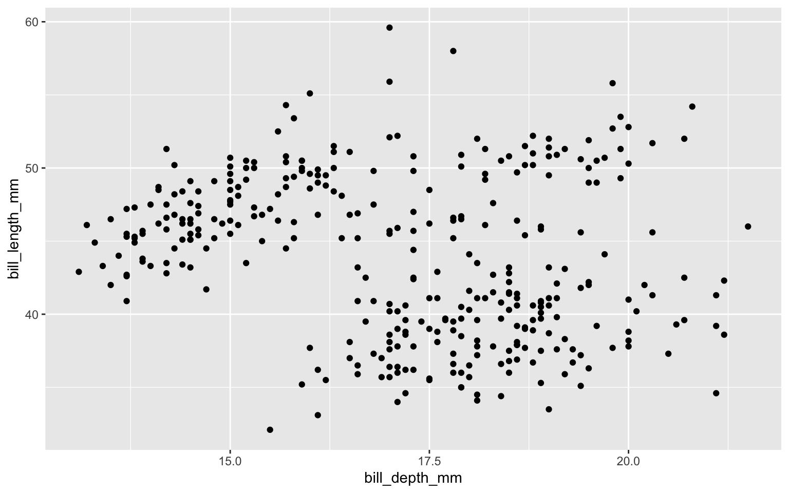
Start with the penguins data frame

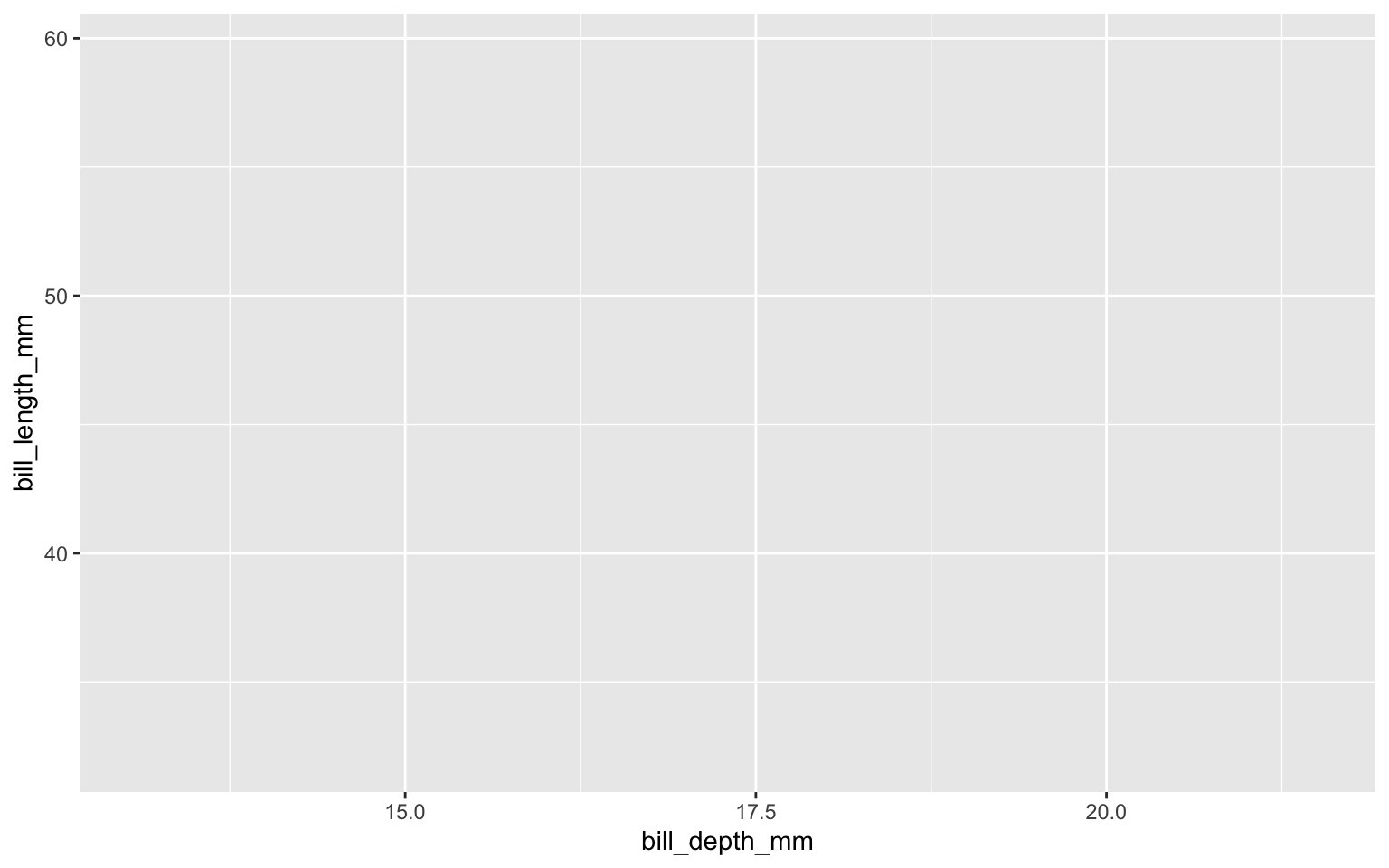
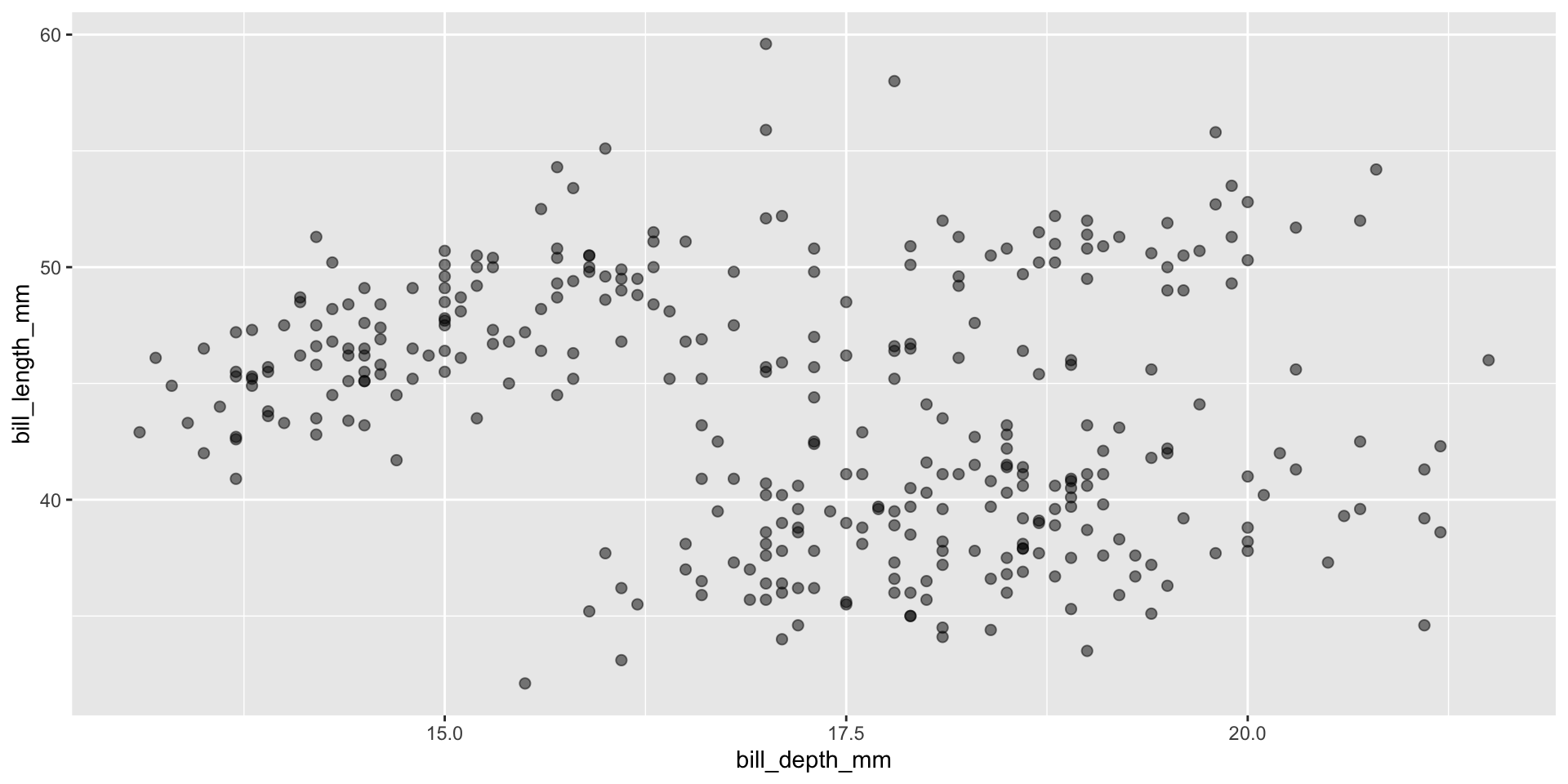
Start with the penguins data frame, map bill depth to the x-axis
Start with the penguins data frame, map bill depth to the x-axis and map bill length to the y-axis.
Start with the penguins data frame, map bill depth to the x-axis and map bill length to the y-axis. Represent each observation with a point
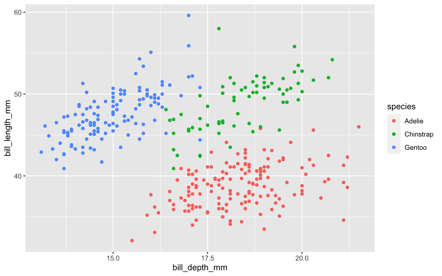
Start with the penguins data frame, map bill depth to the x-axis and map bill length to the y-axis. Represent each observation with a point and map species to the color of each point.
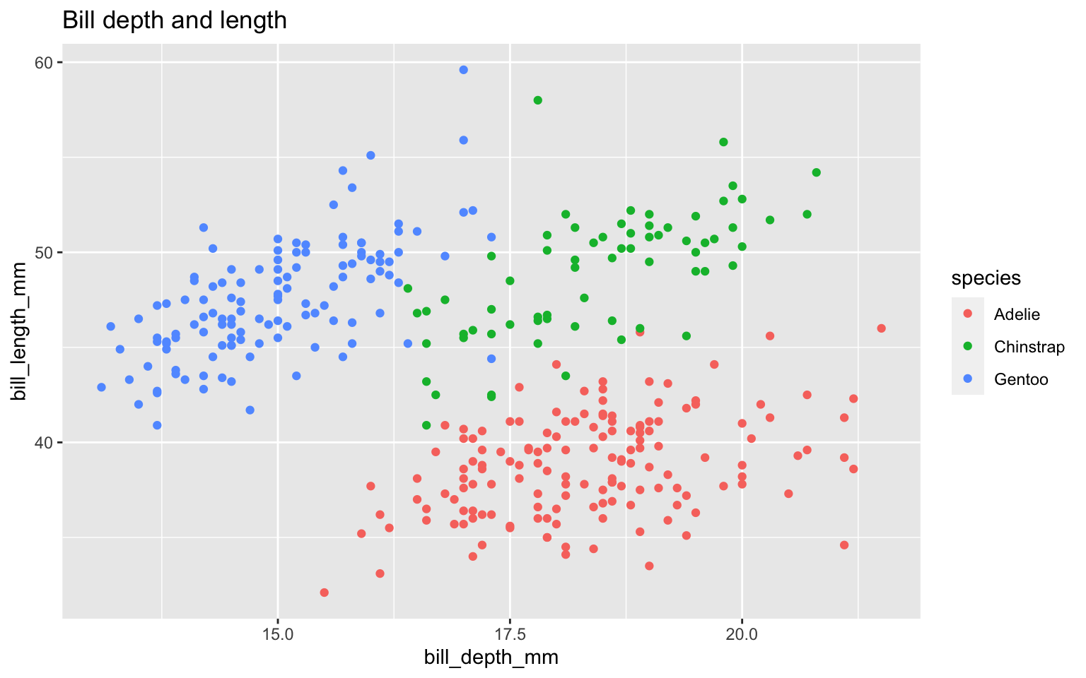
Start with the penguins data frame, map bill depth to the x-axis and map bill length to the y-axis. Represent each observation with a point and map species to the color of each point. Title the plot “Bill depth and length”
Start with the penguins data frame, map bill depth to the x-axis and map bill length to the y-axis. Represent each observation with a point and map species to the color of each point. Title the plot “Bill depth and length”, add the subtitle “Dimensions for Adelie, Chinstrap, and Gentoo Penguins”

Start with the penguins data frame, map bill depth to the x-axis and map bill length to the y-axis. Represent each observation with a point and map species to the color of each point. Title the plot “Bill depth and length”, add the subtitle “Dimensions for Adelie, Chinstrap, and Gentoo Penguins”, label the x and y axes as “Bill depth (mm)” and “Bill length (mm)”, respectively
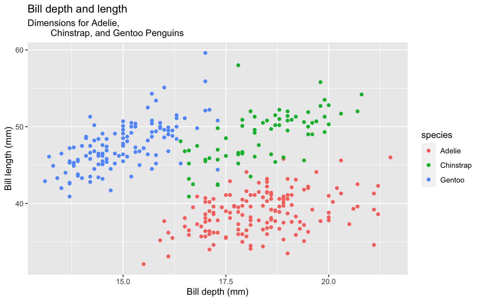
Start with the penguins data frame, map bill depth to the x-axis and map bill length to the y-axis. Represent each observation with a point and map species to the color of each point. Title the plot “Bill depth and length”, add the subtitle “Dimensions for Adelie, Chinstrap, and Gentoo Penguins”, label the x and y axes as “Bill depth (mm)” and “Bill length (mm)”, respectively label the legend “Species”

Start with the penguins data frame, map bill depth to the x-axis and map bill length to the y-axis. Represent each observation with a point and map species to the color of each point. Title the plot “Bill depth and length”, add the subtitle “Dimensions for Adelie, Chinstrap, and Gentoo Penguins”, label the x and y axes as “Bill depth (mm)” and “Bill length (mm)”, respectively label the legend “Species”, and add a caption for the data source.
ggplot(data = penguins,
       mapping = aes(x = bill_depth_mm,
                     y = bill_length_mm,
                     color = species)) +
geom_point() +
labs(title = "Bill depth and length",
subtitle = "Dimensions for Adelie,
Chinstrap, and Gentoo Penguins",
x = "Bill depth (mm)",
y = "Bill length (mm)",
color = "Species",
caption = "Source: Palmer Station
LTER / palmerpenguins package")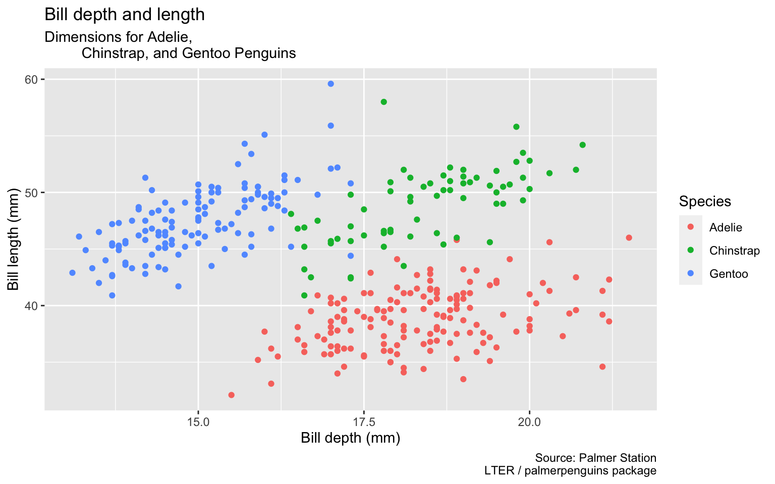
Start with the penguins data frame, map bill depth to the x-axis and map bill length to the y-axis. Represent each observation with a point and map species to the color of each point. Title the plot “Bill depth and length”, add the subtitle “Dimensions for Adelie, Chinstrap, and Gentoo Penguins”, label the x and y axes as “Bill depth (mm)” and “Bill length (mm)”, respectively label the legend “Species”, and add a caption for the data source. Finally, use a discrete color scale that is designed to be perceived by viewers with common forms of color blindness.
ggplot(data = penguins,
       mapping = aes(x = bill_depth_mm,
                     y = bill_length_mm,
                     color = species)) +
  geom_point() +
  labs(title = "Bill depth and length",
       subtitle = "Dimensions for Adelie,
         Chinstrap, and Gentoo Penguins",
       x = "Bill depth (mm)",
       y = "Bill length (mm)",
       color = "Species",
       caption = "Source: Palmer Station
LTER / palmerpenguins package") +
scale_color_viridis_d()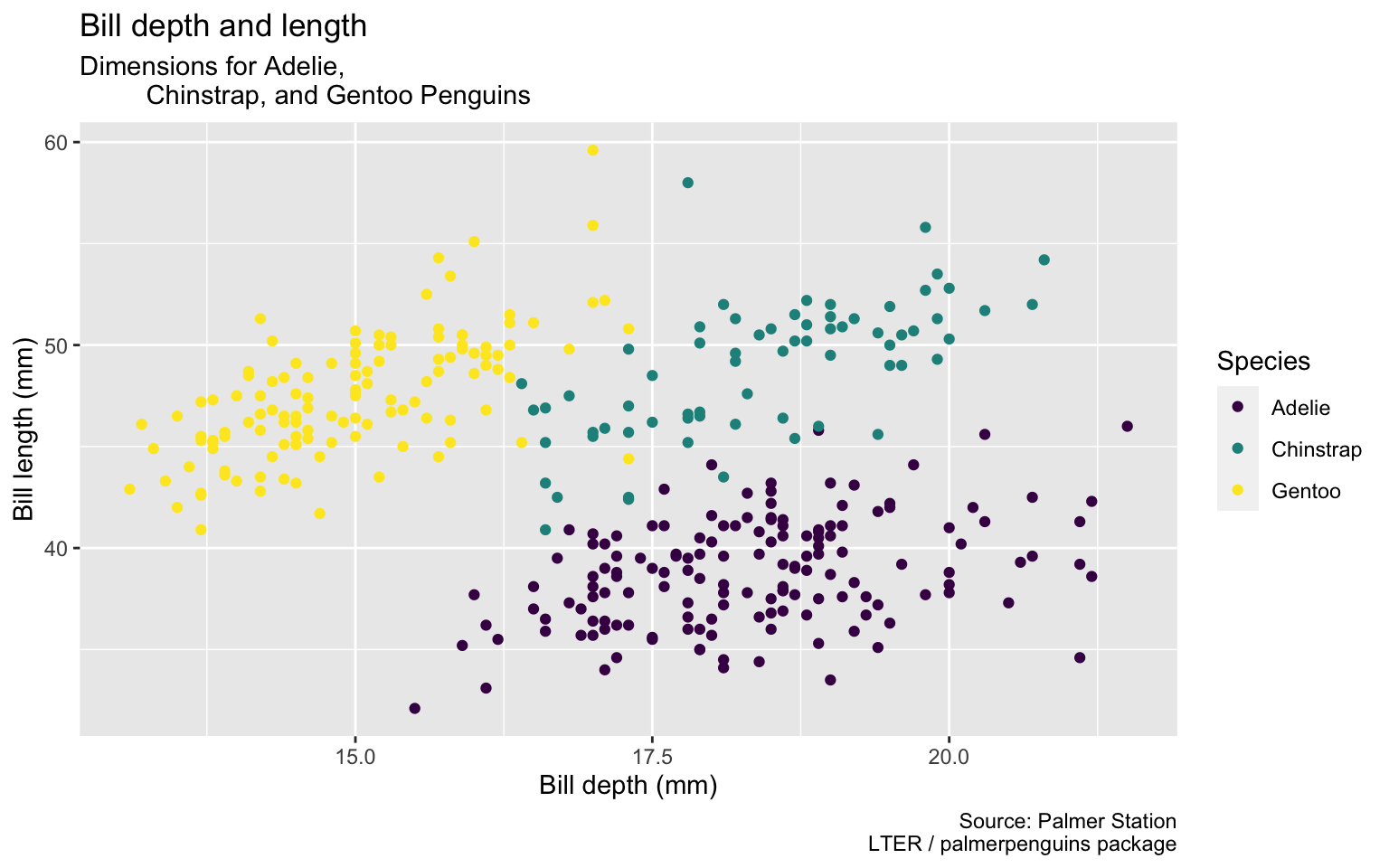
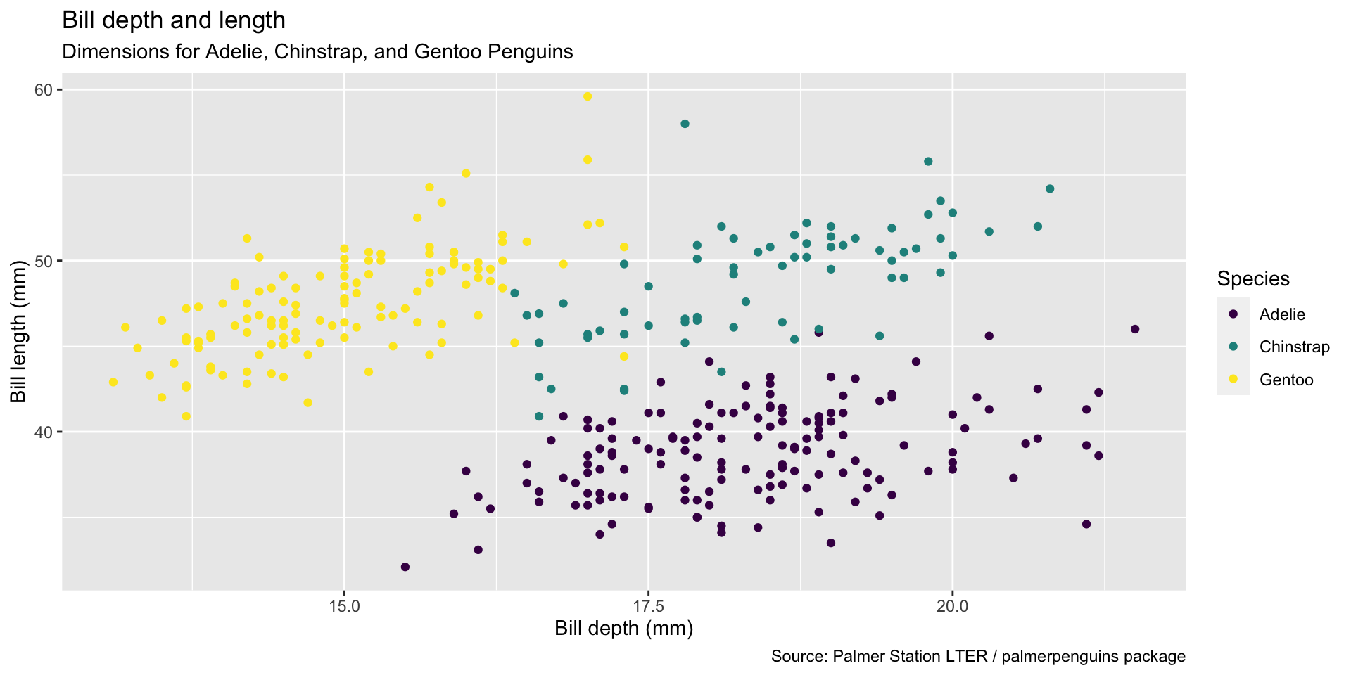
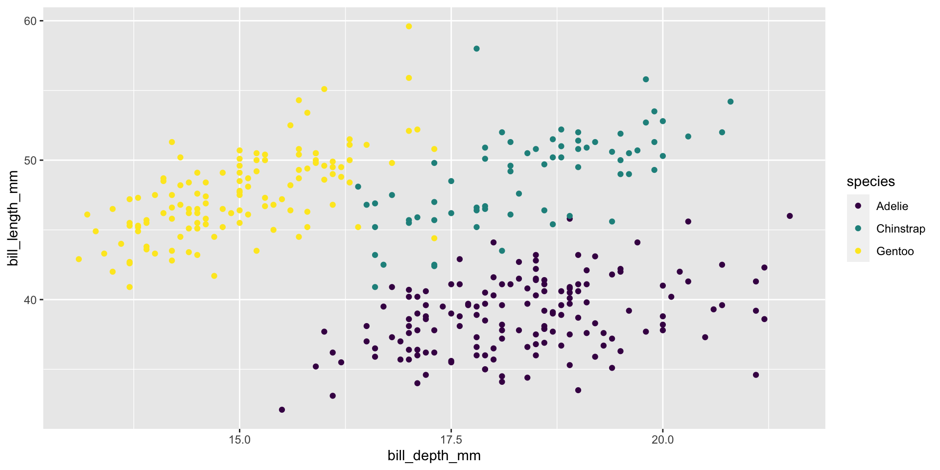
ggplot(data = penguins,
       mapping = aes(x = bill_depth_mm,
                     y = bill_length_mm,
                     color = species)) +
  geom_point() +
  labs(title = "Bill depth and length",
       subtitle = "Dimensions for Adelie,
         Chinstrap, and Gentoo Penguins",
       x = "Bill depth (mm)",
       y = "Bill length (mm)",
       color = "Species",
       caption = "Source: Palmer Station
         LTER / palmerpenguins package") +
scale_color_viridis_d()Start with the penguins data frame, map bill depth to the x-axis and map bill length to the y-axis. Represent each observation with a point and map species to the color of each point. Title the plot “Bill depth and length”, add the subtitle “Dimensions for Adelie, Chinstrap, and Gentoo Penguins”, label the x and y axes as “Bill depth (mm)” and “Bill length (mm)”, respectively label the legend “Species”, and add a caption for the data source. Finally, use a discrete color scale that is designed to be perceived by viewers with common forms of color blindness.
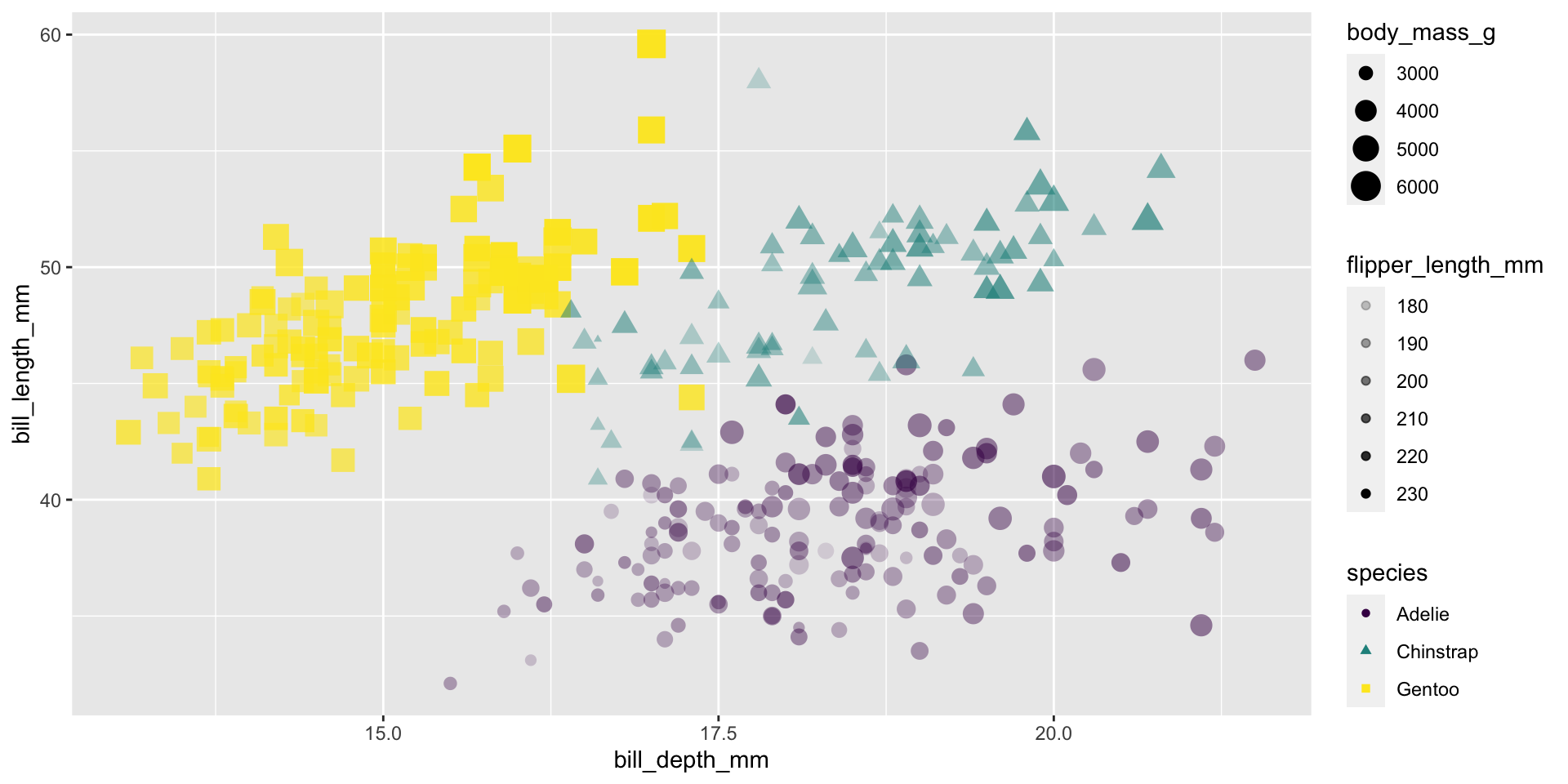
Color
Shape
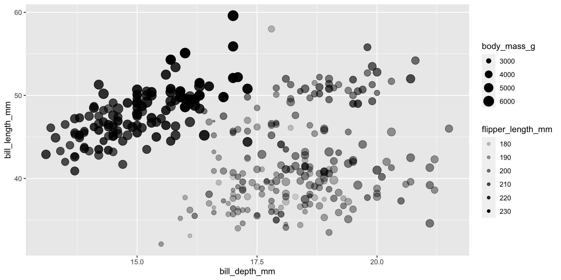
Size
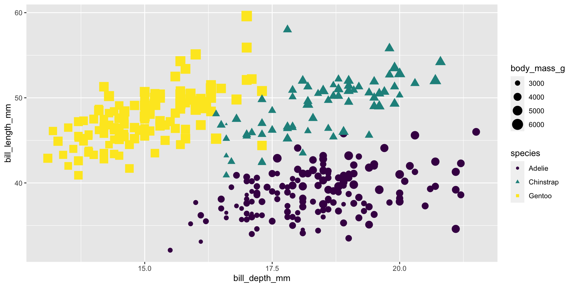
Alpha
Application Exercise
Open the Welcome Penguins folder from Day 1 in RStudio Pro (can’t find it? Copy the files again by following these instructions)
Create a new R chunk (don’t remember how to do this? Make sure you are using the visual editor then click Insert > Code Chunk > R). Using the code in the chunk labeled
plotas a template, create a plot that examines the relationship betweenx= Flipper Length andy= Bill Depth.Update the plot from part 2 to have a different shape depending on the Island the penguin is from.
Change the size of all of the points to 3.
Be sure to update all labels to describe what you have created.
BONUS: Is there any missing data? What is the plot doing with the missing values? See if you can get rid of the warning message.
10:00